Does the film Saw use most of the conventions?
The opening sequence to Saw (2004 - Horror/Thriller):
Title - the opening of the film shows the title 'Saw' in medium size with a sort of hazy effect around it to draw the audience to the film, this creates a sense of mystery within the film.
Production Company Logo - The company 'Twisted Picutres', which
is behind the film production and distribution.
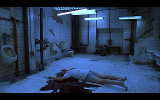
Setting/location - The setting of this film is strange and as the audience we do not have much idea where they are (it seems to be a bathroom but with a dead man on the floor).
Characters - A few characters through the opening sequence of Saw, so
that the audience could engage or have a feel of the characters.
The
opening to Saw built tension through numerous ways, use of camera, sound,
editing as well as mise en scene.
There are parts which are edited very finely - a blurred and zoomed
effect which were used to show that the man was possibly feeling like
this (everything's a blur). Also, tension was built
through the sound which were diegetic sounds that heightened. This opening sequence gives the audience a taste of what will be coming in the film sharp twists, unknown plots and eerie locations which shall keep the viewer at the edge of their seats from the start till the end.


No comments:
Post a Comment